The Source Zero
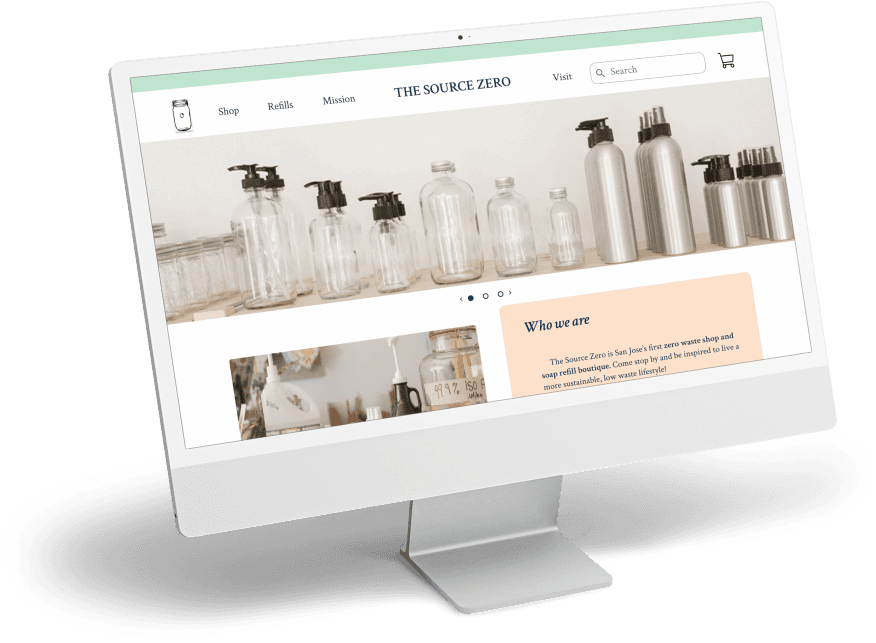
Helping a mission driven eco-boutique connect their customers with products they love.
Getting to Zero Confusion
Information Architecture
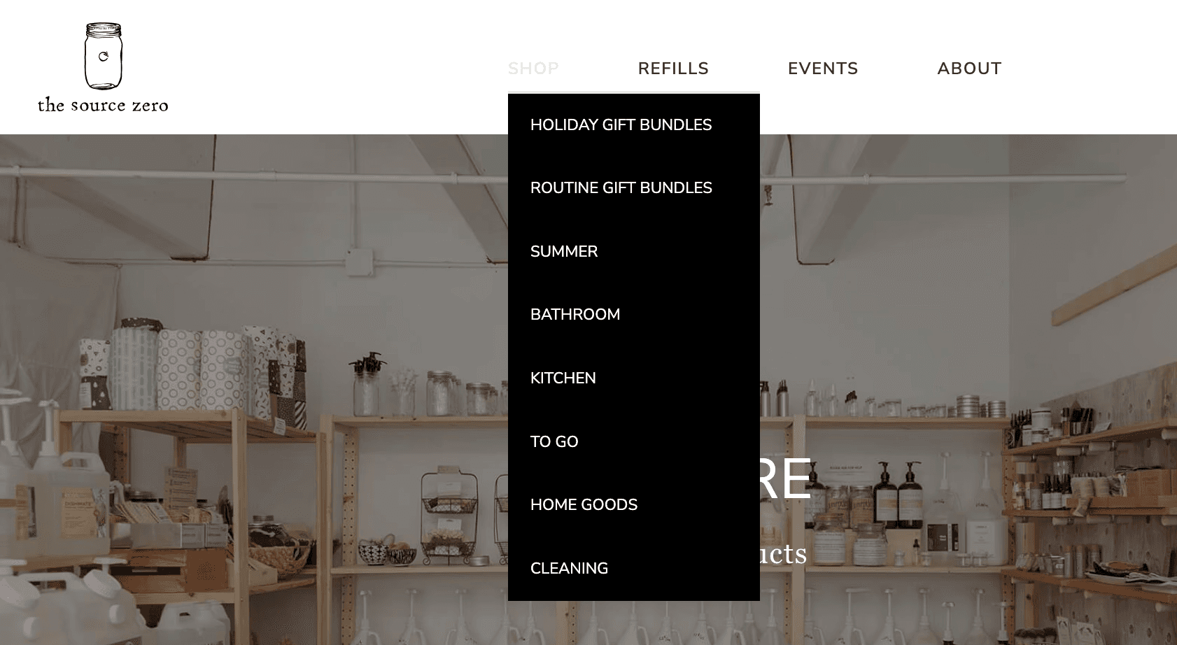
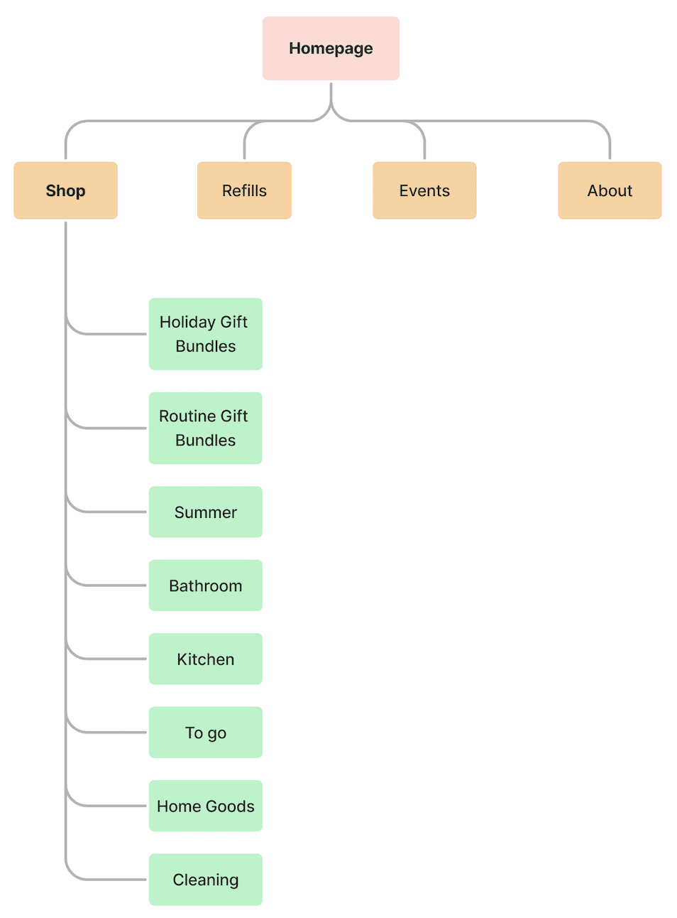
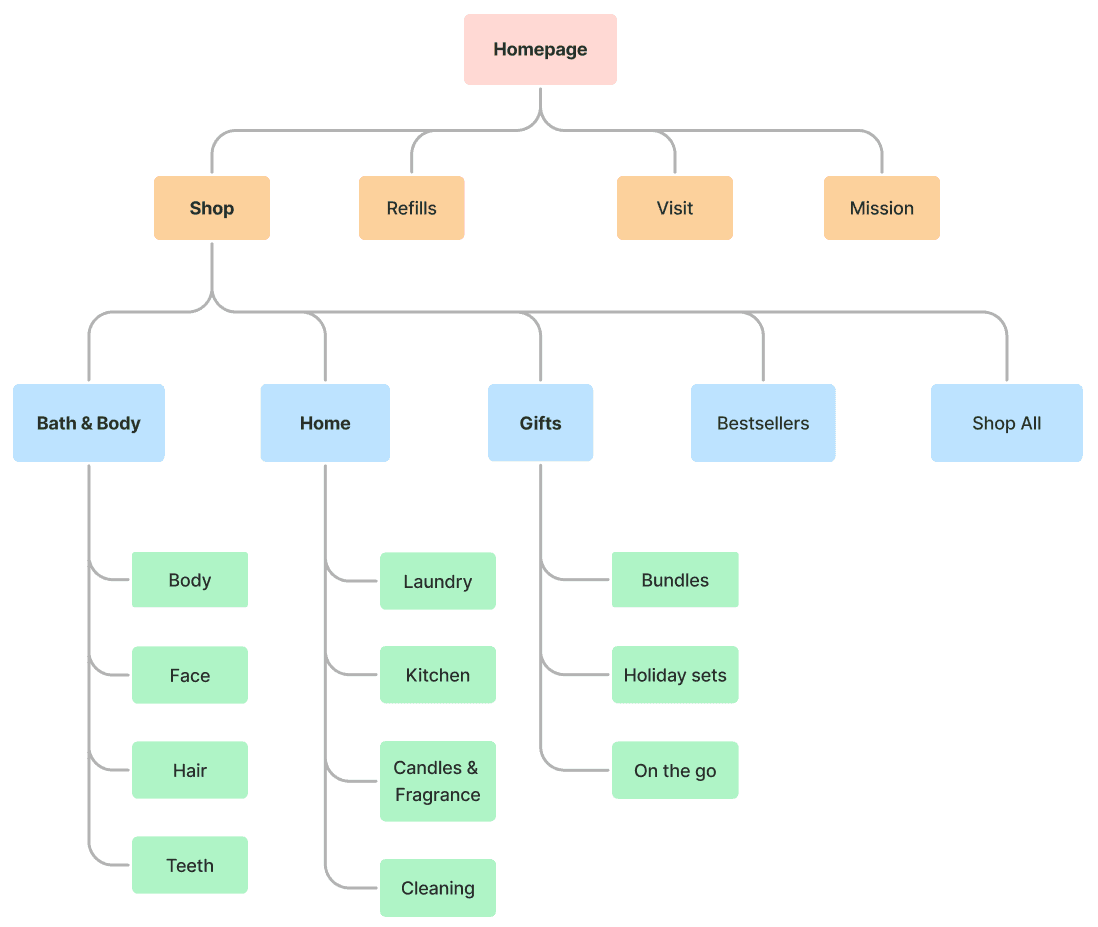
To address the confusion users had with the main navigation, I conducted an open card sort where I asked 10 participants to come up with their own terms to categorize The Source Zero's products. I analyzed the results to identify converging themes and created a site map that better reflected how users thought products should be grouped -
Original
Updated Version
Sketches
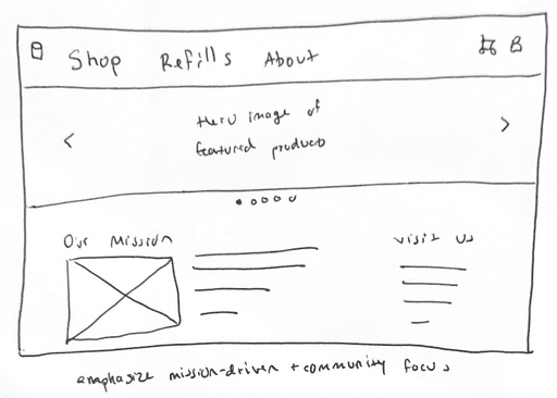
Home page
More spacious layout which highlights best-selling/new products and in store events.
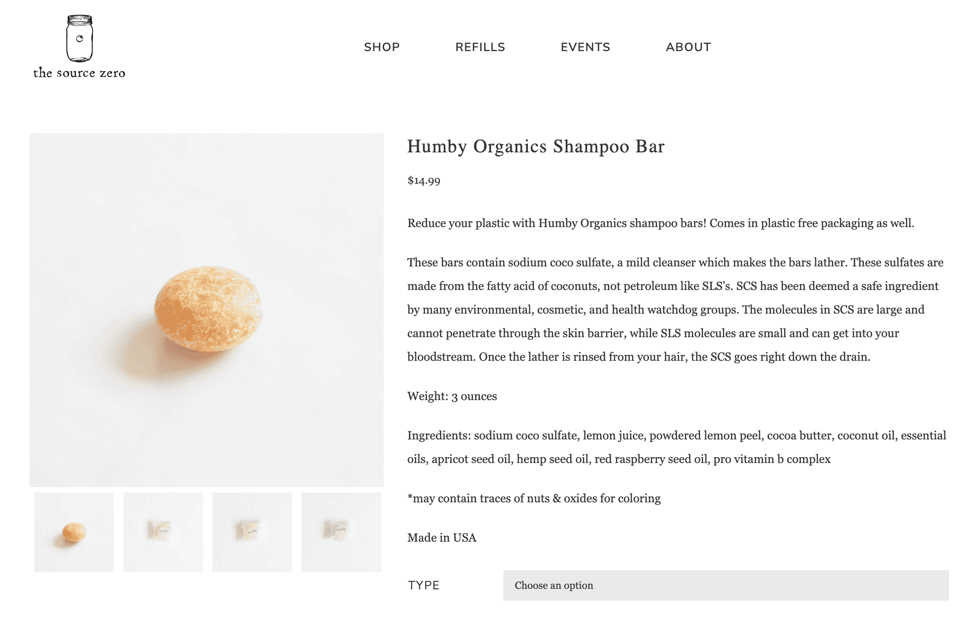
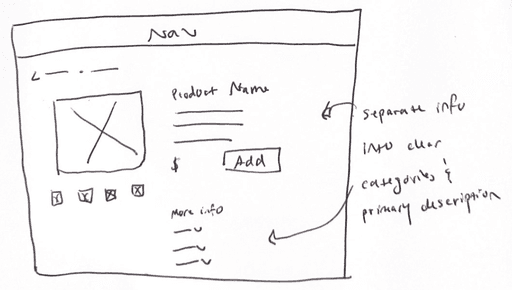
Product page
Better organize product information and make environmental impact obvious.
Reduce, Reuse, Redesign
Mid-fidelity Usability Tests
Using the same tasks from usability testing the original site, I ran 5 more usability tests with my redesigned version to evaluate whether the changes I made would help users accomplish their goal of easily finding and purchasing products that align with their values.
task success rate for completing the in-store pickup flow.
said the product information would help them decide whether to purchase the item.
found the information they were looking for within 30 seconds.
Design Changes
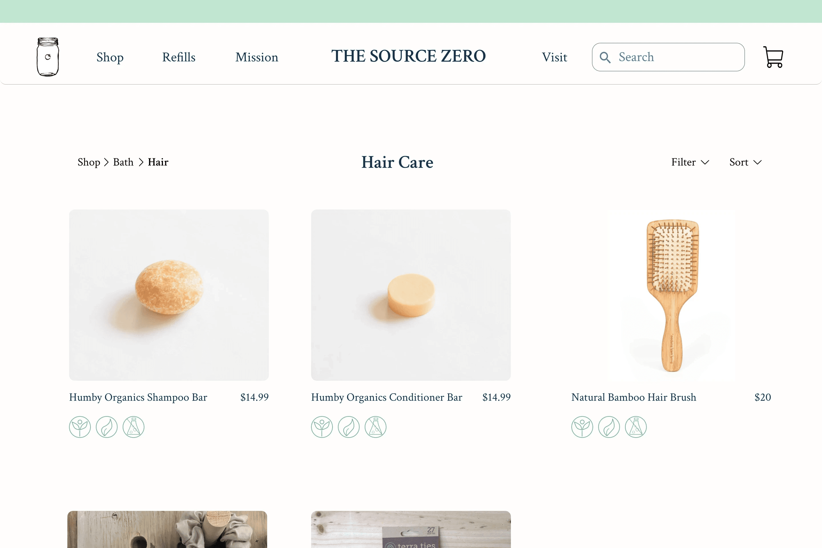
Overall the results were significantly improved from the first version. Based on feedback and performance, I made some improvements to the navigation design and product gallery.
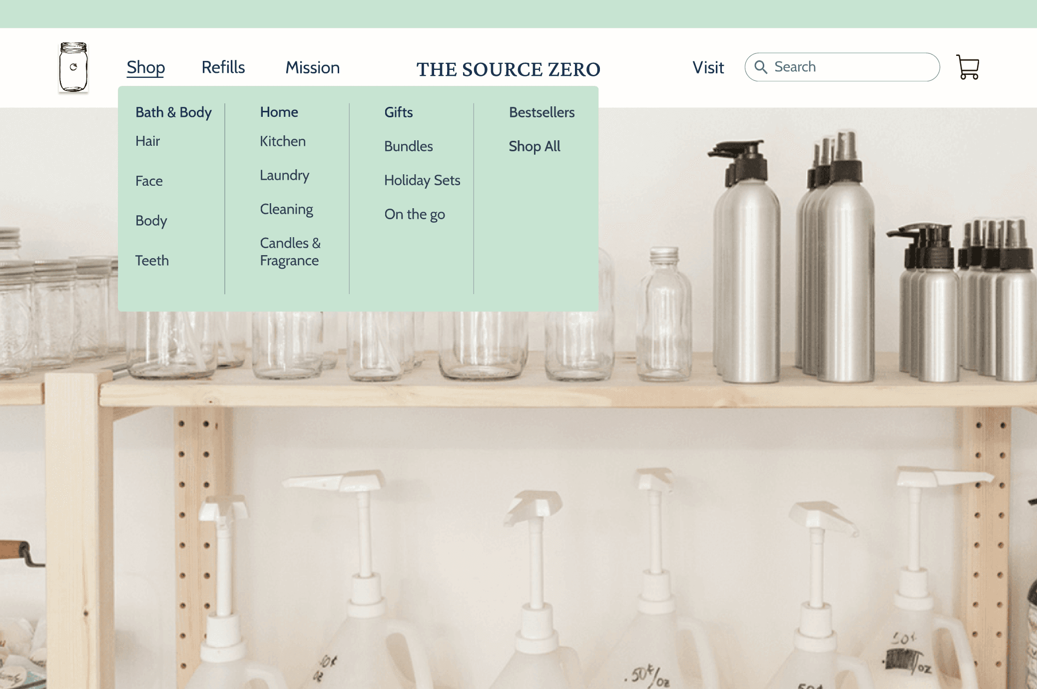
1) Navigation
Feedback: Left to right organization was confusing and increased the amount of time it took to find the relevant page.
Change: Separated the global categories and nested local ones underneath to make them more distinct.
2) Product Details Page
Feedback: Users wanted information about the environmental impact of products front and center.
Change: Added icons that describe key sustainability qualities of the products (recycled packaging, biodegradable, etc.)
3) Checkout
Feedback: Users wanted a more personal touch when receiving an order confirmation.
Change: Rewrote confirmation copy and included a call to action to visit in-store events.
Accessibility Audit
Original Site
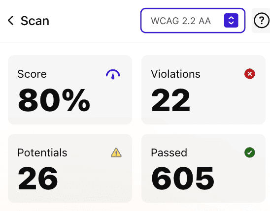
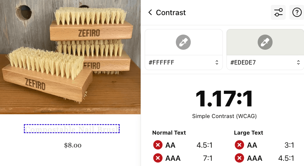
The Source Zero's website had a few accessibility violations that needed to be addressed, particularly around color contrast where key navigation and product links could could barely be seen when hovered over.
Overall WCAG score
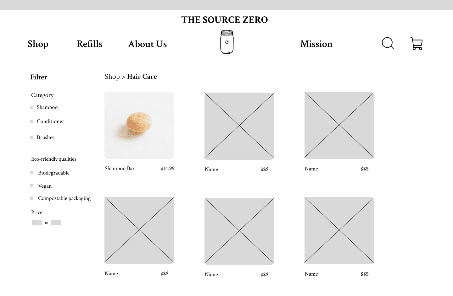
Product gallery page
Redesign
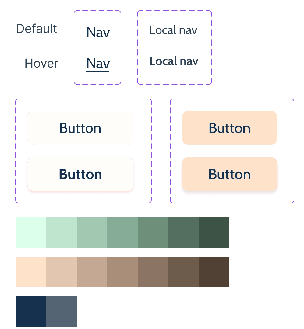
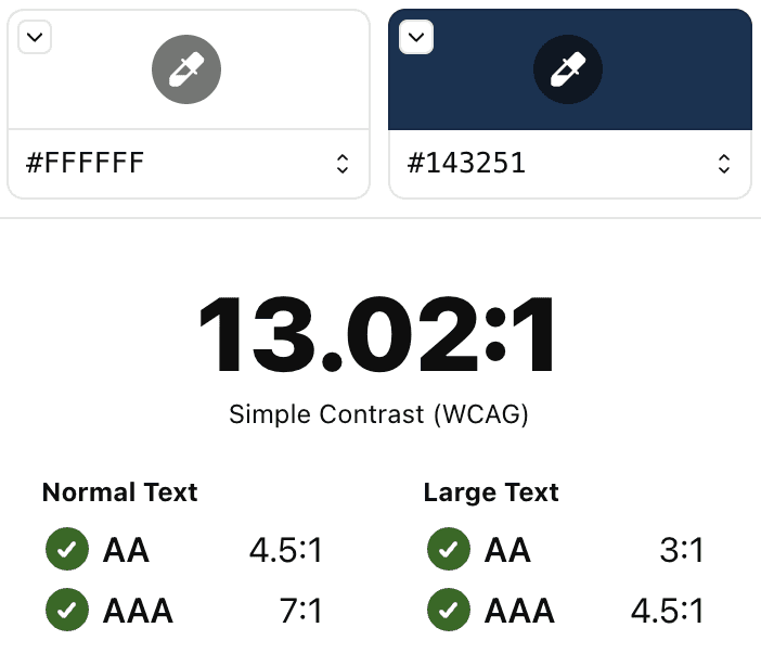
I created a new design system that reflected The Source Zero's brand colors and tone while resolving accessibility issues.
Design system
Text contrast ratio

